Project summary
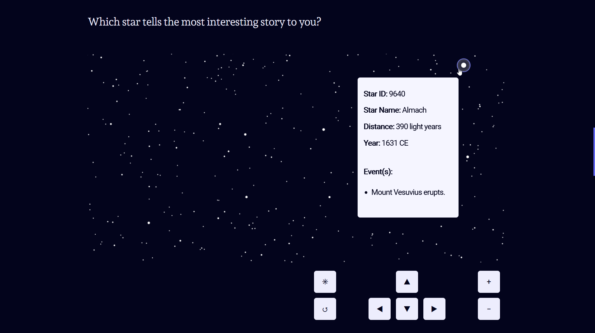
The light from the stars travels for years (and years) until it reaches your eyes. This interactive map of the night sky shows you for each star what happened on Earth when the light started traveling from the star to you. That way, any star has a story to tell you. You can zoom in, move around and hover all the stars to reveal the historical events they are connected to.
If you haven’t seen the project yet, feel free to go there now. I’ll wait here.
Explore this projectBelow I’ll go through some of the steps I took to build the project, some design considerations, as well as some pieces that did not make it into the final project.
Table of contents
Inspiration
This whole project was inspired by a scene in the excellent movie Nomadland, written, directed, produced and edited by Chloé Zhao. In that scene someone says (pointing at the night sky):
That's the star Vega, but it's 24 light years away. So what that means is the light that you're looking at left Vega in 1987. — And it just got here.
I had not thought about light years in that way before. Sure, I was aware that the stars are very far away. But connecting the distance of a star to a date in the past: that was an idea that struck a chord with me. My next thought was to build an interactive map of the night sky that would somehow connect light years to historical events.
Data
I knew I wanted to built the project with Svelte and had hopes that someone had done a map of the night sky before (maybe even in d3?). But before starting to develop any code, I researched a bit about stars in general. How far away they are. How distances are typically measured (Parsecs!?). One thing was clear: I had to make a selection of stars, because there are simply too many of them.
Finding star coordinates
After some Wikipedia rabbit holes, I quickly found d3-celestial, which seemed to be the perfect starting point at first glance, since it advertises itself as an ”Interactive, adaptable celestial map done with the D3.js visualization library“.
However, I quickly realized that it would not be trivial to integrate the d3-celestial script into a Svelte project and still gain full control over presentational attributes and interaction parameters.
But crucially, d3-celestial provided me with the starting point: ”GeoJSON for sky stuff”. Which is to say: coordinates that can be used to build a map of stars with Svelte & d3.
This is what my initial draft looked like. A static map of the night sky:
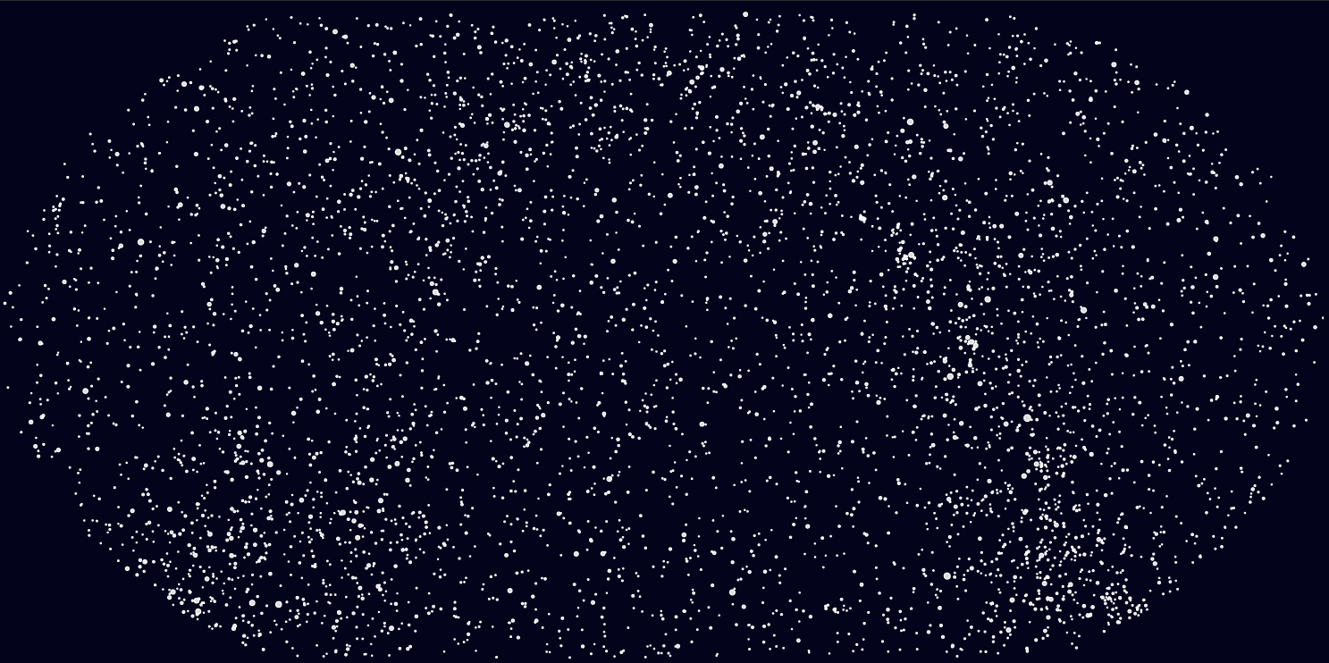
After playing a bit with different projections, I landed on the equirectangular projection, because it looks more like what you’d expect to see (based on typical photographs or simply looking at the actual night sky). It was an interesting revelation that the same kind of algorithms that are used to compute 2D representations of the 3D sphere we call Earth can also be used to compute 2D representations of all the stars around us.
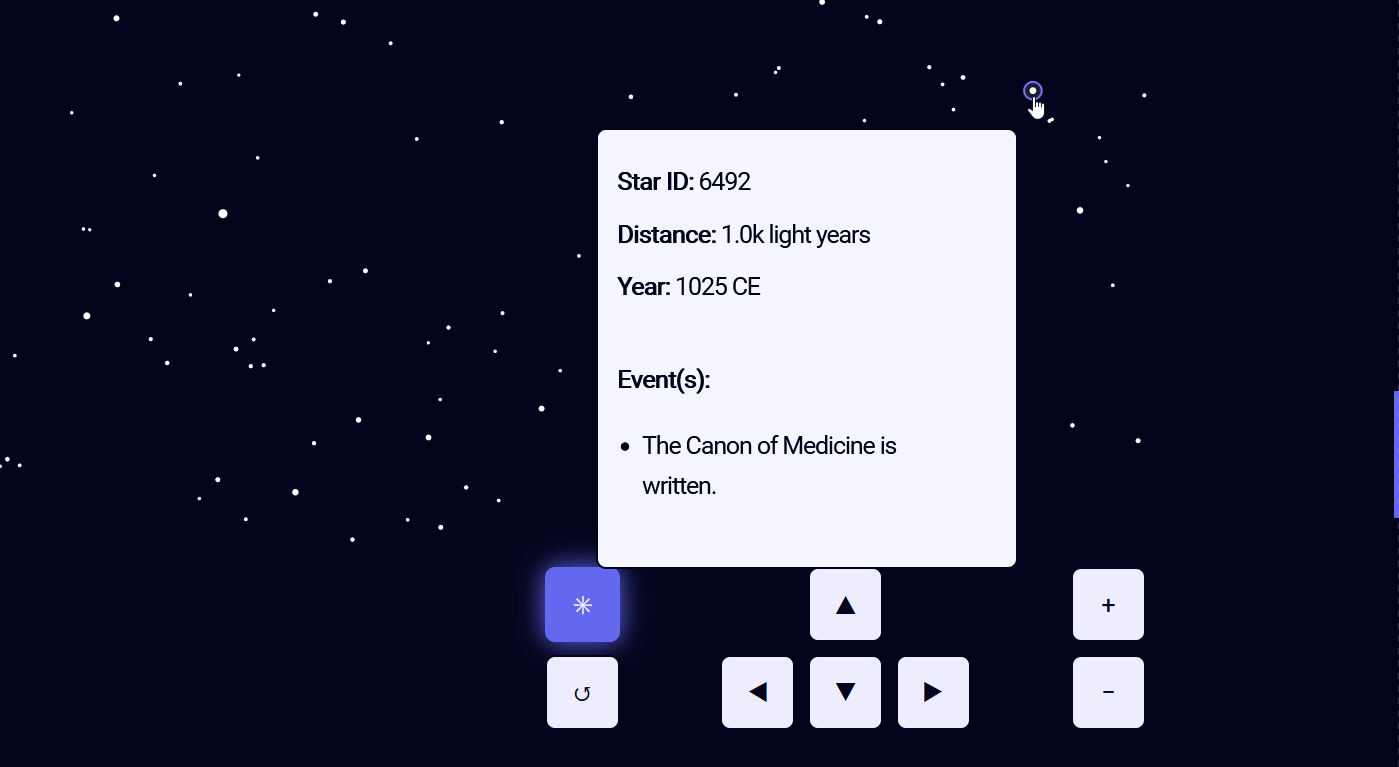
This is what my next iteration looked like. A static map of the night sky, with a tooltip that is shown when you hover exactly over a star:
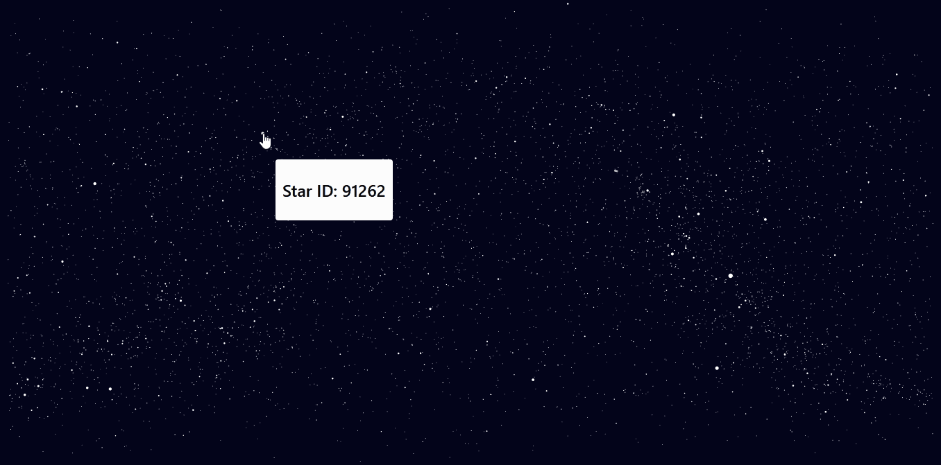
But, as you can probably imagine, it’s a frustrating experience to try to aim the mouse cursor exactly at one of those tiny white circles. If you can’t imagine that, you can go have that experience right now, in the REPL over here.
The solution to this problem is called Voronoi:
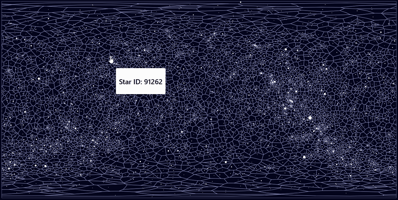
Given a number of points, a Voronoi-algorithm will compute a mesh of cells. Each of these cells contains exactly one of the initial points and will span as much room as possible. So what you end up with is a magic spider web that will tell you for any space between two points which of the original points is closest. Tada!
Finding star distances
With that in place, I turned around to the data again and started to look for another database that would provide me with the distance in light years. Because d3-celestial nicely provided the coordinates for the stars, along with an ID, but no distance measure was included. I found the HYG Database, which contained the distance, as well as the same type of ID. Now I could write some code to match each star via their ID and combine coordinates and distances (converting from Parsecs to light years along the way).
Finding historic events
Next to considering the Wikipedia Timelines, I also played around with the Archive API of the New York Times, which goes back all the way to 1851! But while that is impressive, it’s just a tiny fraction of what was needed to match the star distances in light years.
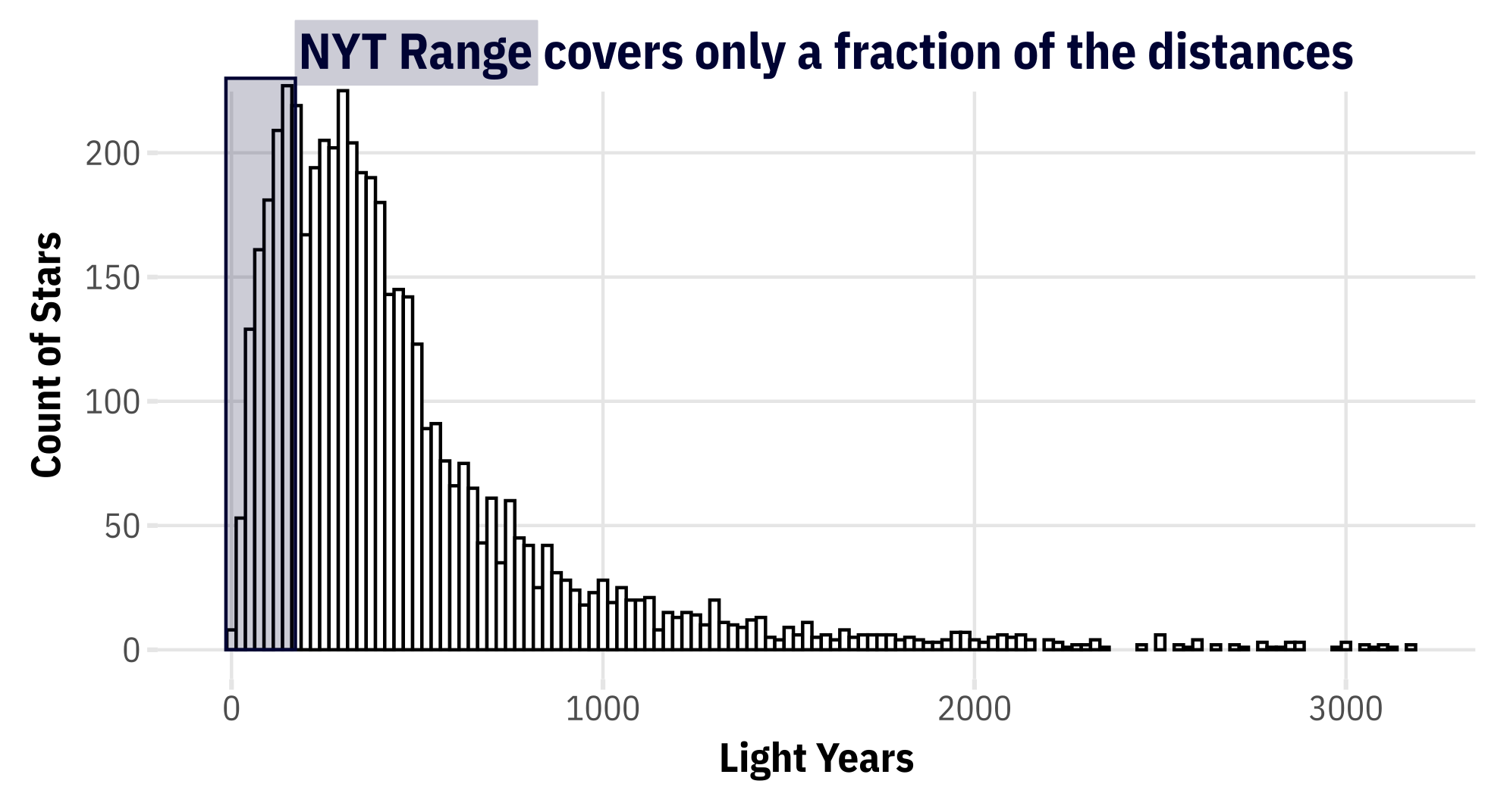
As you can see in the chart above, the stars in my data were spanning a much larger range of distances in light years than the NYT API could cover. With this range in mind, I turned to Wikipedia again and started collecting the different timelines into one coherent stream of events (in a giant table). This was surprisingly messy and the different timelines were not consistent in their structure so that on top of scraping the data, I needed to do quite some manual cleaning to ensure that only dates and events remained in my table. In the end, I had a table with 2070 entries that included historical events from 3200 BCE until 2022-12-31.
Want that data?
Merging star data and historic data
The final step in the data preparation process was to find matches between each star’s distance in light years and the appropriate historic event(s). There were a few obstacles that made this challenging:
- Handling dates is hard, no matter what your tool is (I looked at JavaScript and
lubridatein R and used the latter in the end) - Handling dates that deviate from common patterns is even harder (e.g. if your parser expects
YYYY-MM-DDbut gets 871-01-01) - Handling dates in BCE is the worst. At least from what I saw, it got handled so badly. I guess it’s because most of the code that gets written to match dates is referring to current events, not events from the ancient past…?
Especially when trying to write code that would handle both BCE and CE dates gracefully, I had to account for many special cases. In the end, I went for the pragmatic solution: I split the data between BCE and CE and handled them separately.
For each star, I calculated which date corresponds to now - lightYears.
That gave me a unique date for each star, but not yet a match with any events in the historic table.
To find that match for each star, I needed to programmatically find the closest match between star-date and historic-date.
The matching function
If you ever find yourself wanting to match some dates, here is my solution to that problem:
# make sure you have lubridate installed and loaded
library(lubridate)

# a helper-function to find the closest match for a given date
find_closest_match <- function(date, reference_dates) {

  # this relies on lubridate-magic to find the closest date
  # within all of the reference_dates.
  closest_index <- which.min(abs(date - reference_dates))

  # return the date as a string of characters,
  # (it gets screwed up otherwise)
  # don't ask me about it.
  closest_match <- as.character(reference_dates[closest_index])

  return(closest_match)
}

# how to use it:
# example dates (make sure they are really dates and not just strings)
test_date = ymd("1922-01-31")
historic_dates = ymd(c("1922-01-15", "1922-02-02", "1922-02-28"))

# which of the three is closest to the test_date?
find_closest_match(test_date, reference_dates = historic_dates)
After solving that little puzzle, I had what I needed: for each star, the closest corresponding item in the table with the historic events. With that, I was able to merge all that data together (or join the two tables, as they say) and produce one giant geoJSON-object that contained 1) star-coordinates, as well as 2) the distance in light years AND 3) the closest matching historic event(s). Yay!
Design
Colours
I based all colours off a very very dark blue that I picked to look like what I imagine the void between the stars looks like. Based on that blue hue, I created the purple, that I used throughout the site as an accent colour (e.g. for the scroll-bar, to add emphasis to the currently selected star and for the hover-styles of the buttons). The two bright colours are based on the same blue hue as well to make them all work together nicely. These are the 4 main colours:
- Background color
- hsl(238, 80%, 6%)
- Accent color
- hsl(238, 80%, 66%)
- Fonts
- hsl(238, 80%, 96%)
- Tooltip Background
- hsl(238, 98%, 98%)
The colours in action:
Units
I implemented a little unit switching component to toggle between kilometers and miles. This was fueled by some project that I had seen that used °F, which is hard for me to interpret, since my brain works with °C by default. So I wanted to give users the freedom to choose which measure of distance they prefer for my project.
My aim was to enable users to toggle between the two units and apply that change across the whole site. Here is an example of two values. If you toggle one of them, the other changes too.
Distance to go once around Earth (tap to toggle units):
Distance from Sun to Earth (tap to toggle units):
Adding a toggle button or another way to centrally control this feature would have been possible too, but I opted for the more subtle inline-text version.
Want to play with that component?
Here you go:
Control buttons
I decided to make a control panel to make the actions users can take on the map very explicit.
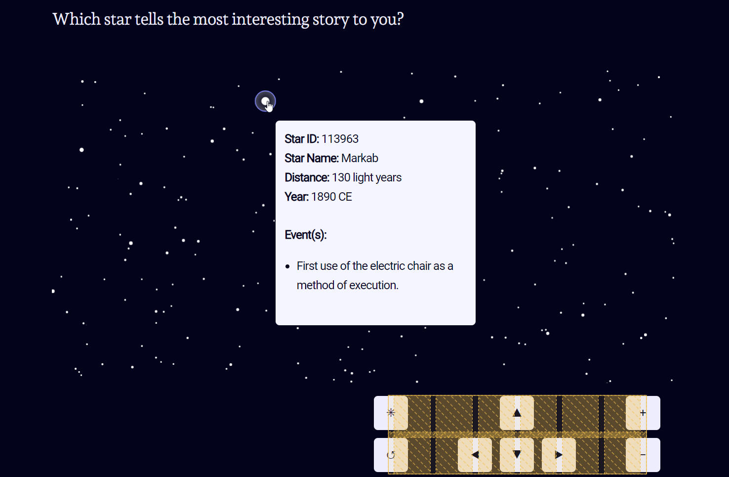
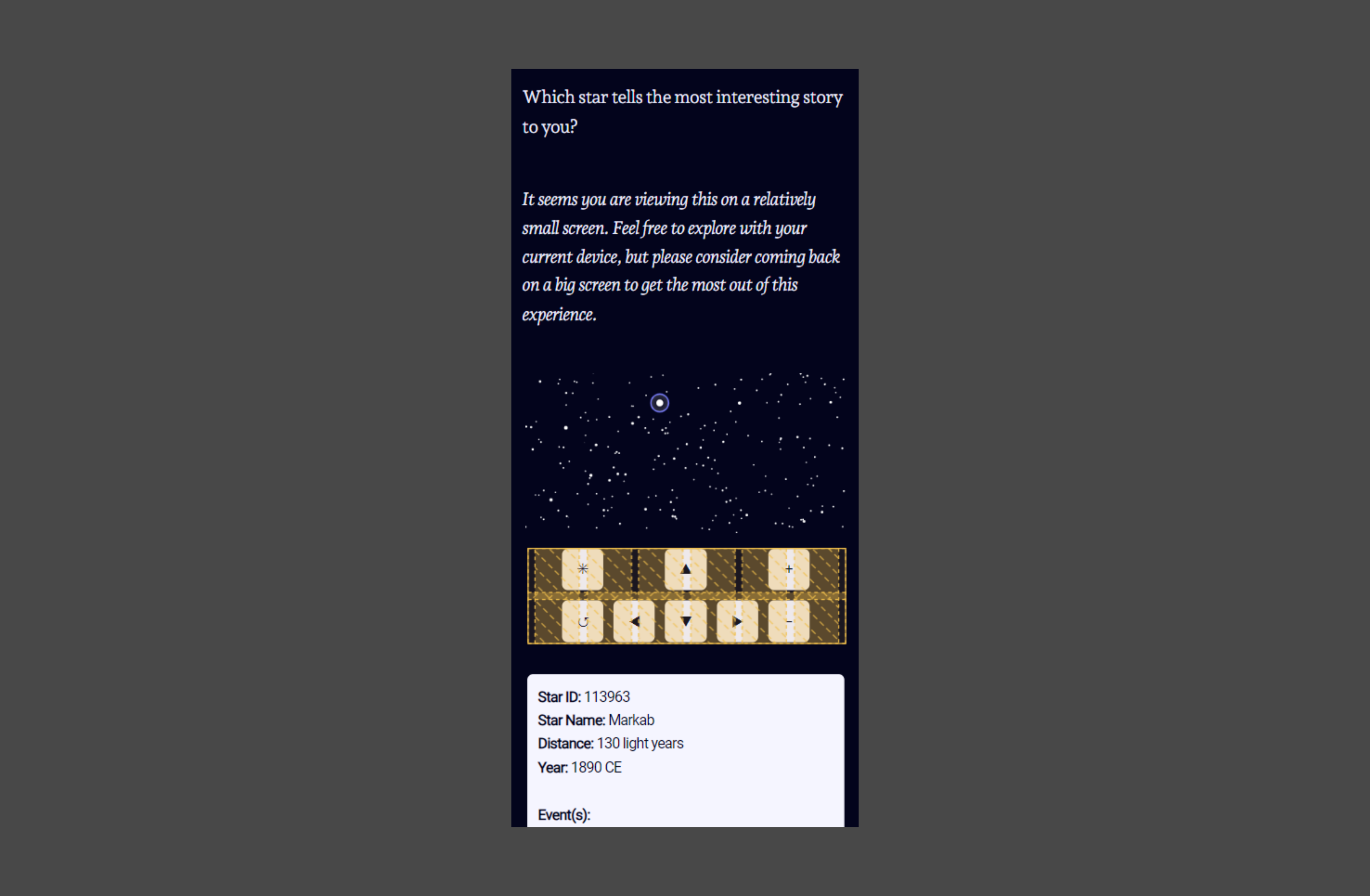
The biggest challenge here was to find a design that works on wide and narrow screens. In addition to my beloved utopian fluid spacing values, I found that I needed two slightly adapted versions. One for wide screens with more breathing room between the buttons, that is right-aligned (see picture above). And another for smaller screens that is more compact and aligned in the center of the screen:
Fonts
I picked Andada Pro as the main font, because it it has the flair of a timeless classic with a modern touch. The serif style is balanced with some very neat slab-style details, like the straight descender of the y. As a nice bonus I also found out that Andada Pro has some decorative elements, like the star-glyph I used on the very top and the very bottom of the page (and the favicon):
Inside the tooltip, that is shown when a star is hovered or selected, I chose something with a more technical feeling and found that Roboto was a nice sans-serif match to Andada Pro.
Outtakes
In my early drafts, I had a longer introduction, that contained not only more text, but also an additional type of interactive element: a little animation to showcase how fast light is traveling. I decided to cut those out for the final piece to guide the reader faster to the centerpiece: the map of the night sky. But I’m still fond of the little interactive dot plot animation I developed, and therefore, I’ll share it with you right here, right now. Here is how long the light needs to travel from Sirius to Earth if 1 light year would take 1 second:
Crazy, right? In reality, the light travels 8.6 years until it reaches you. And that’s a tiny distance, when you compare it to the vast majority of stars out there…
Wrapping up
I learned a lot while building this project and loved tinkering with the little details. There will probably be a future iteration that will have a full-screen mode, and I’m considering adding filtering controls to show stars that match date criteria (like show only stars that between 30 and 35 light years away).
Thank you for reading! If you have any comments or questions, please let me know!